Thinking of ways to improve your business branding? Good — because implementing the principles of good graphic design is your ticket to powerful branding!
Graphic design doesn’t have to be scary…
Graphic design is the process of creating your visual brand, which is what people will see first — the logo, the colors, and the mascot or spokesperson if you have one. It is one of the pillars of business branding, and it strongly affects how people perceive your brand — at least at first impression.
Let’s get you up to speed with some graphic design 101.
Here’s what you’ll learn:
- What Is Graphic Design?: A Quick History Lesson
- Why Is Graphic Design Essential For Business?
- What Are The Aspects Of Graphic Design?: The 7 Elements Of Art
- What Is Color Theory In Graphic Design?
- How Important Is Typography In Graphic Design?
- What Should I Look For When Hiring For Graphic Design Work?
- Where Can I Get Graphic Design Audits For My Brand?
What Is Graphic Design? A Quick History Lesson
Graphic design is the process of creating visual content that conveys meaning and ideas to an audience.
Take a stroll just in your neighborhood, and you’ll see graphic design everywhere — store signs, advertisements, cars, shop windows, and even the tattoos of people you walk by. (Tattoos are a form of personal branding.)
Graphic design uses fundamental concepts like lines, shapes, fonts, space, form, texture, colors, and typography to create an end-product that gives meaning.
So, where did graphic design even begin?
Well, it’s older than you might think.
Design was a thing eons before it was associated with computer art software — it goes back to 38,000 BCE when it was used in cave paintings for communication.
It was found that even the ancient Sumerians used pictures and symbols that had different textures and shapes to convey meaning.
As we fast-forward to today, the quality of a design often creates your first judgment when it comes to many things, including businesses you’re thinking of working with!
Everything about a website — from its logo and color schemes to its overall design — contributes to your initial assumptions about the business. All these small impressions either spark your interest, or not.
This is one reason why great graphic design is crucial for your business.
Why Is Graphic Design Essential For Business?
Every business has something uniquely valuable to offer.
But before people learn what you offer, they have a first impression of your brand. Crisp, well-developed graphic design is one of the subliminal ways you communicate value – and your confidence in the service you provide.
Things like your fonts, color schemes, logo, and other imagery contribute tremendously to a stranger’s assumptions about your business. Humans are visual beings.
It even goes as far as color psychology — how a color’s meaning gets associated with what you have to offer.
This is one aspect of color theory that we’ll talk about later.
Here are other key reasons why great graphic design is essential for your business:
Helps Express Your Company’s Values
Every business is different.
We have different mission statements, drives, core beliefs, and “whys” behind our brands. You can bring your values to life with graphically rendered images and taglines that convey your brand’s unique qualities.
Typography — the fonts you use — speaks volumes. So does the unique artwork or visual templates you use in published content. Both are used to differentiate you from competitors.
With graphic design that stands out, so will your company’s values stand out in the eyes of your customers.
Aesthetically Pleasing To The Eyes
Beauty is in the eyes of the beholder…
But most people know great graphic design when they see it. In fact, really great graphic design is something we experience more than merely see.
When the elements of a visual brand complement one another, you’ll have an aesthetic designed to target your ideal client.
This aesthetic will be associated with your business, which elevates you before potential customers even work with you.
Now, this should be just the icing on the cake and not the cake itself.
What I mean is that what truly will make your business great will be a combination of elements: your product, customer service (the cake), as well as the graphic design – your visual brand (the icing).
Instant Brand Recognition & Marketing Advantages
Brand recognition describes the point when consumers become conscious of a company based solely on logos, company slogans, art, color combinations, shapes, and more.
Big brands like Coca-Cola (fonts, colors), Adidas (lines/shapes and spacing), and McDonald’s (colors and shapes) all use graphic design fundamentals to sharpen their brand recognition.
And here’s another thing:
This recognition (which graphic design contributes to) helps invoke feelings about the brand. These can be perceptions of the brand’s likability, trustworthiness, and reliability.
Brand recognition also overlaps with brand awareness and marketing strategies cultivated to keep a company top of mind.
With a company’s imagery top of mind, customers can remember to buy from them or reach out to ask questions about new products and services.
Invites Professionalism & Trust
Professionalism is a requirement for any successful business.
Because even if a company is doing great today, if professionalism is lacking, it’s only a matter of time before things start going south.
Now, sure, professionalism begins with your staff, but before potential customers even speak to someone, professionalism is in your branding.
Graphic design helps give your company a genuinely professional feel.
You don’t have to have Picasso-level artwork to bring a sense of professionalism. It can simply be the HD definition of your logo or the textures you use in combination.
With this “assumed” professionalism from your market, they will categorize you with other companies with high credibility and trust.
What Are The Building Blocks Of Graphic Design?
Here, I’ll outline the basic building blocks of graphic design.
Lines, shapes, form, space, texture, value and color, will all show up in what you’re designing in one way or another.
1. Line
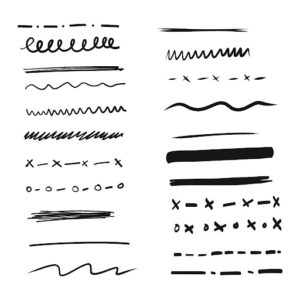
Lines are one of the basics in design, and they come in many forms.
When you hear “line,” you probably think of a solid black line.
But lines can be…
- Dotted
- Curvy
- Dashed, short dashed, and long dashed
- Zig-zagged
- Horizontal
- Vertical
- Diagonal
- Parallel
And much more.
Lines not only come in many forms, but they have a bunch of use-cases.
You can use lines as:
- Borders for a logo or an image
- A divider for information
- A background element
- Textures and patterns
- Elements that create a map design (building blueprints, maps, etc.)
You see lines used constantly in logos like in these examples:
When it comes to your business, see how you can incorporate lines in your website, infographics, and marketing materials to emphasize things or even organize information.
2. Shape

Shapes are 2D figures with boundaries, which are a big concept in graphic design.
And yes, they are often incorporated in logos and come in many forms:
- Organic shapes: irregular and natural shapes we see in reality (like leaves on trees)
- Abstract shapes: Shapes that come in all types of variety, don’t have set parameters
- Geometric shapes: Identified by the number of sides they have and adhere to mathematical rules
Graphic designers also use texture and color to add dimensions to shapes and make them look 3D.
Just like lines, shapes can be incorporated into your business materials to make things stand out or fill in empty space.
Certain brands have even used shapes as elements that represent their company.
For example, Microsoft’s 4 squares is a widely recognized logo (as simple as it is.) Lamborghini uses the hexagon on their vehicles and yachts to create instant brand recognition.
3. Form

Form is the 3D representation of a shape.
In graphic design, forms are created by adding texture and shading to shapes to give them depth.
You can use form to create depth with the letters in your business pieces to help them pop out more and attract your reader’s attention through a form of realism.
4. Space

Space is about how different parts of your design relate to each other.
How far apart are your objects and words?
How much space do they take up?
Are you incorporating negative space (blank areas)?
Using space helps you emphasize certain things and reduces confusion, balancing out your piece. For example, you’ll (hopefully!) find good spacing between images and words on business presentations so that everything is understandable.
A great way to calculate space is to use “the rule of thirds.” This is when you use a 3×3 grid, having your subject occupy ⅓ of the image, with the other ⅔ providing background and further context.
5. Texture

Texture can be used in many ways to convey meaning. For instance, you can add lines and shapes to an object to create roughness.
Pretty cool, right?
Textures can also express what your brand represents. For example, an eCommerce business selling products for mothers and newborns can use a “soft” texture in their lettering (typography) to express their brand.
6. Value

Value is all about the lights and darks of your piece.
The big picture?
Value is a great way to bring shine to a business logo, or make an object of color stand out by contrasting it with a black and white form on the value scale.
7. Color

Oh… here’s one we are all probably familiar with!
Color is one of the central elements of graphic design and can vary in tone.
No matter what you need done – a website, business card, logo, or advertisement. Colors are scientifically proven to evoke emotional responses and associations, and help things stand out.
Believe it or not, the colors you use for your business can directly impact how inviting people perceive it to be.
Let’s dive deeper into color theory and how it works!
What Is Color Theory In Graphic Design?
Every skill or profession has a set of best practices necessary to achieve a great result.
Professional graphic designers look at color theory to help guide the direction of their pieces.
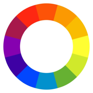
One thing to know about color theory is how to read the color wheel. This “wheel” is a circular graphic that conveys the connections between primary, secondary, and tertiary colors:
Source: invisionapp
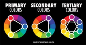
- Primary colors – Red, yellow, blue
- Secondary Colors – Orange, green, purple
- Tertiary colors – Mixing primary and secondary colors (amber, teal, violet)
Color theory also has rules to help us understand wicht colors match well with one another. For example, if you’re looking to revamp the colors of your business, you can pair complementary colors, analogous colors, or triadic colors.
Here’s a great breakdown:
Source: sarahrenaeclark.com
It’s also important to look at the color psychology aspect when it comes to your business.
Sure, colors can match, but if they don’t fit with the niche or marketplace you’re serving...it may do more harm than good.
Again, this ties into branding, so here are some things to know about when it comes to color psychology:
- Red – Triggers power and negative emotions, brings appetite, creates a sense of urgency
- Orange – Associated with warmth, less “corporate” and more encompassing (great for social enterprises)
- Yellow – Brings “fun” associated with optimism.
- Green – Relaxing, associated with “health,” it’s nurturing and is also related to finance.
- Blue – The color of trust and dependability.
- Purple – Royalty, spirituality, and sophistication
- Pink – Passion and caring. Used to show openness
- Silver and white – modern, advanced, simplicity
- Black – Power and authority. It contrasts greatly with lighter colors to balance your brand out.
How Important Is Typography In Graphic Design?
Typography is another huge part of graphic design.
After all, this is what your brand is conveying “under the surface” of what you’re saying.
Think about it: reading a “mean” message that’s in cursive makes it sting a little less, doesn’t it?
So with typography, you can see that the font you choose correlates with how your business is perceived.
If your brand is very simple and to the point, simple fonts like Helvetica, Arial, and Verdana are great choices for titles and logos. If your brand is on the sophisticated side, fonts like RoxboroughCF, Bakerie Bold, and Daydream are great choices.
The big picture with typography is the importance of conveying your meaning while still being legible.
After all, you could have the best website in the world but if it’s hard to read, your message won’t land.
If you’re stuck on typography, search for a designer whose past work demonstrates work with a range of fonts, in ways that seem appropriate to the brands.
And, speaking of brand-correct design elements like fonts, let’s discuss what to look for in a graphic designer if you’re outsourcing design work.
What Should I Look For When Hiring Graphic Design?
Graphic design is a specialty; one it takes years of training t o develop. Even if you have the skillset, you may need to outsource design tasks and reserve your time for running your business.
When hiring a graphic designer, look for previous work that shows their understanding of implementing fundamentals like shapes, spacing, value, and color.
Invite them to talk about their pieces and their thought process. It’s best to, of course, interview multiple candidates to see distinctions.
A great graphic designer asks excellent questions about what your business is all about. What your brand strategy is, your ideal customers, and how you serve them. Be sure to be as detailed as possible in what you want and if you’re not sure, always ask for suggestions.
Lastly, talk about project deadlines and communication channels to ensure design projects are delivered on time!
With a great graphic designer on your team, your business is equipped with more creative direction!
Where Can I Get Graphic Design Audits For My Brand?
You’re looking at them!
At The Allyson Group, we make a note of your business’s creative needs and help you implement designs that pair well with your website’s content.
This is branding 101, after all. And it’s a big deal because having sound fundamentals brings you the attention you need to stay competitive in your marketplace.
If you’d like to learn more about brand audits and build strong content for your audience, feel free to book a quick discovery call with me here.
Wishing you the best on your business journey!

